ArcFont Best Practices
Image guidelines and optimization tips for optimal ArcFont results
ArcFont Best Practices
To achieve the best performance with ArcFont, follow these image preparation guidelines and optimization tips.
Image Guidelines for Optimal Results
Recommended Image Characteristics
Optimal Specifications:
- Format: Square images preferred.
- Text Size: Text line height should be 7% to 39% of image height
- Text Content: Single or multiple lines supported - use characteristic letters when possible
- Color: Single color text (avoid rainbow or gradient effects)
- Background: Monochromatic backgrounds work best, though any background works decently
- Font: One font per image.
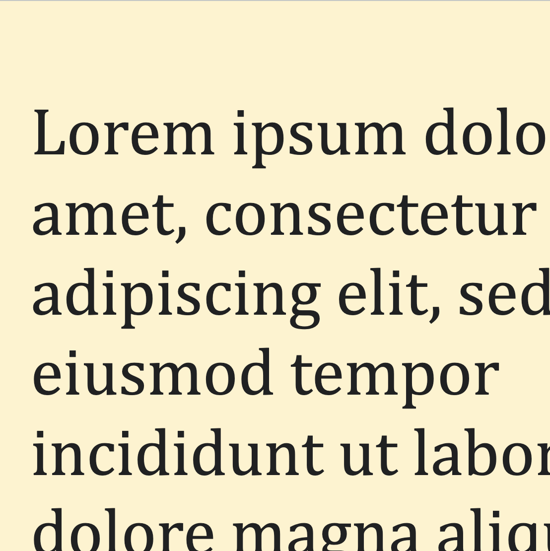
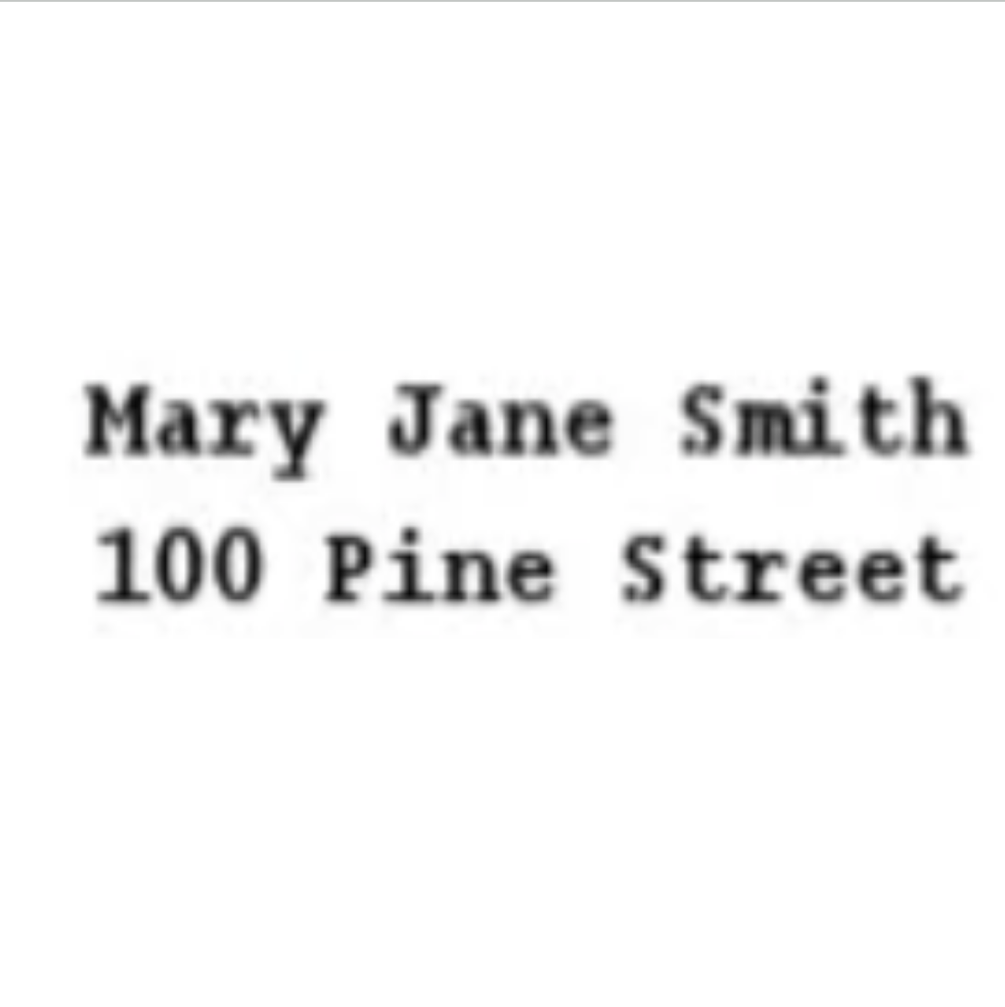
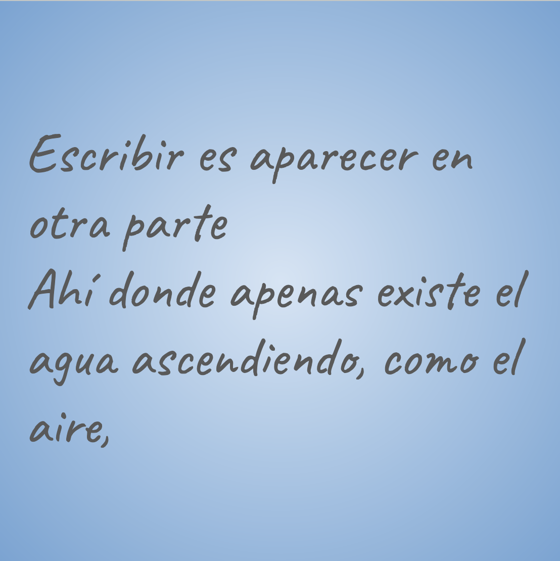
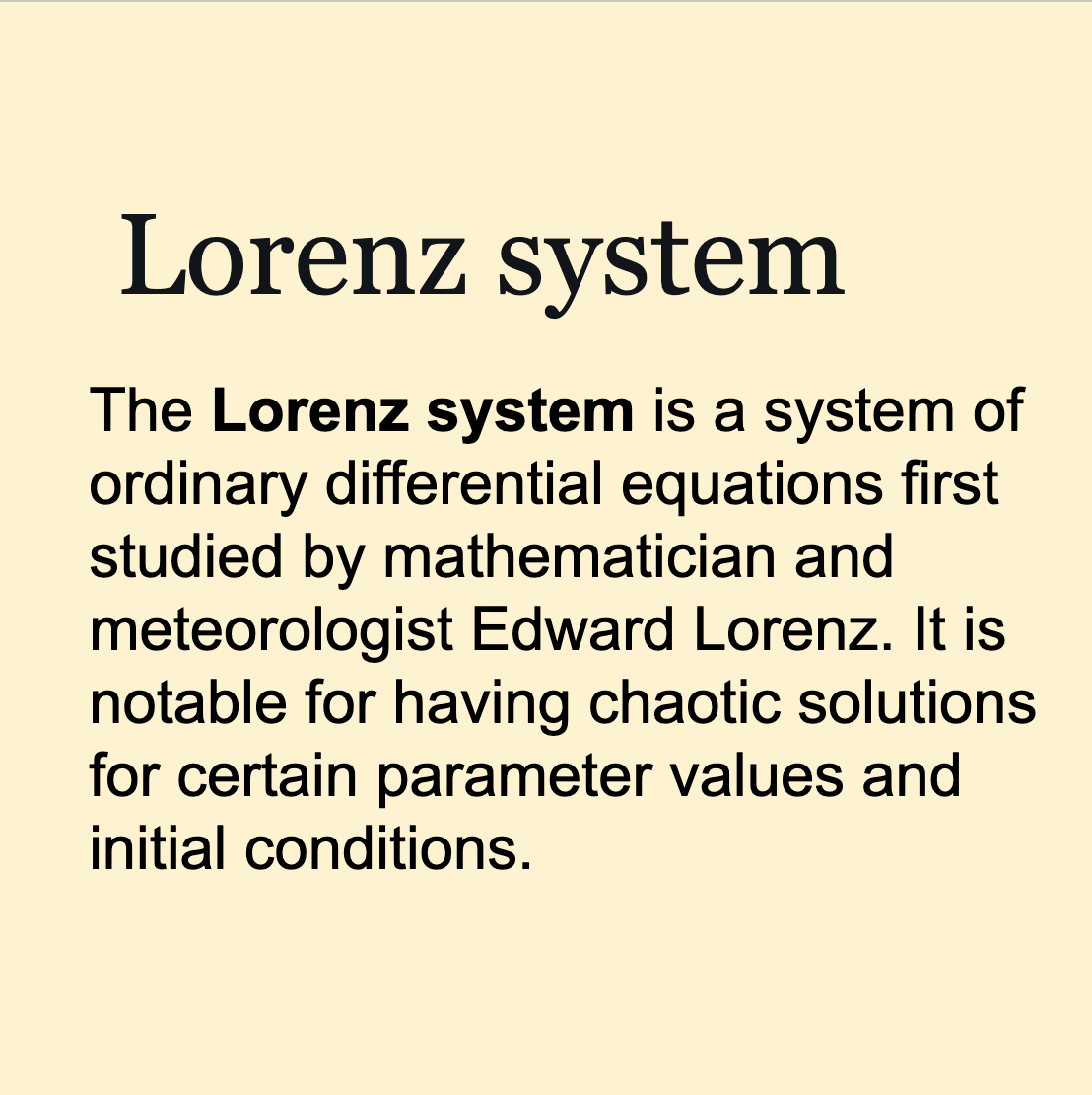
Good Image Examples ✅
- Multiline or single line text
- Text size between 7% and 39% of image height
- Single color text
- Monochromatic backgrounds work best, though any background works decently
- One font per image.
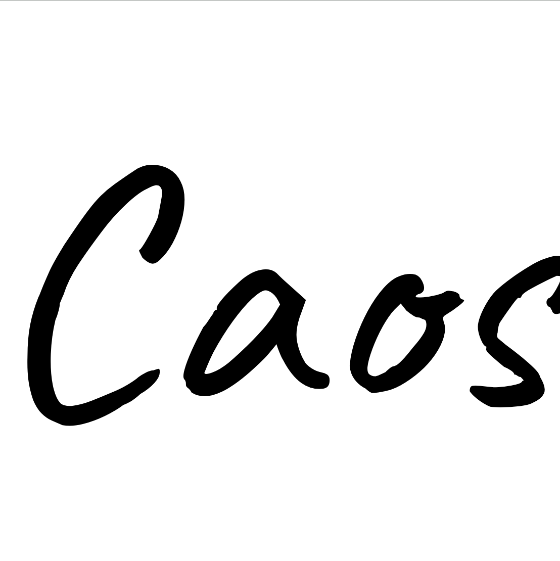

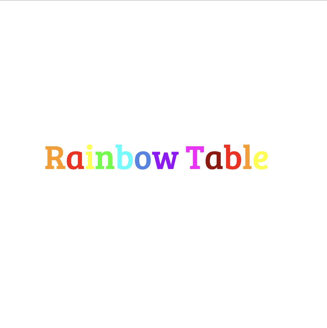
Poor Image Examples ❌
- Text with multiple colors
- Images with multiple fonts
- Small text size
- Very busy background

Search Optimization
- For font search Start with k=5, adjust based on your needs
- Consider distance values < 0.3 as highly similar fonts
- Use the returned metadata (category, family) to filter results
Low Quality Results
- Issue: Poor font recognition accuracy
- Solution: Check text size (7-39% of image height), improve contrast, use square format